
Problem to Solve
ENI Group's existing online presence lacked consistency and visibility across its different services. The challenge was to present four distinct businesses with clarity—without fragmenting the user experience or diluting the overall brand identity.
Project Objective
Design a corporate website that brings together ENI Group’s four subsidiaries under one consistent platform. The main goal was to modernize their online image, highlight the range of services clearly, and offer intuitive navigation for both clients and candidates.
Process
1. Understanding the brief.
2. Research (brand, competitors, market trends).
3. Content structure / sitemap.
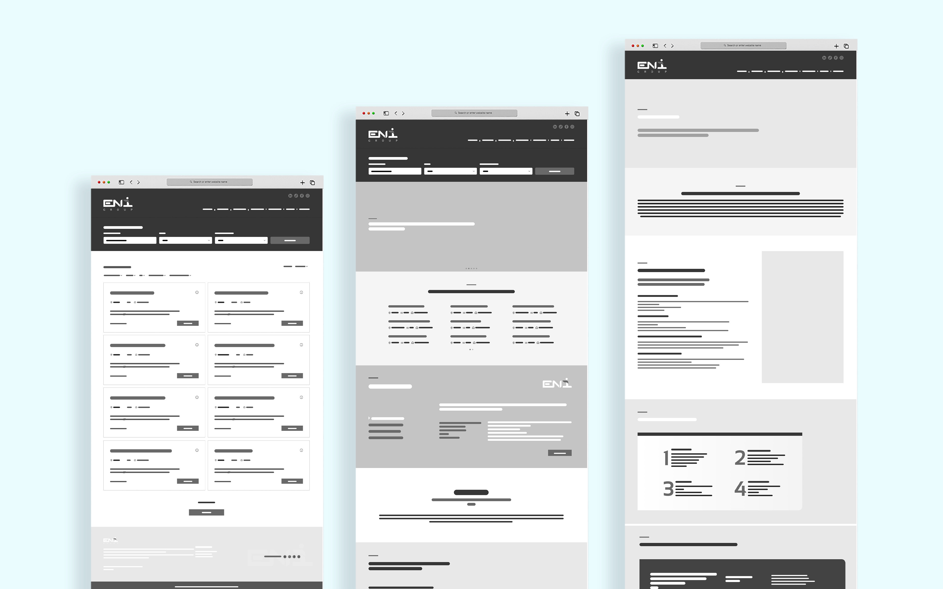
4. Low-fidelity wireframes (layout planning and flow).
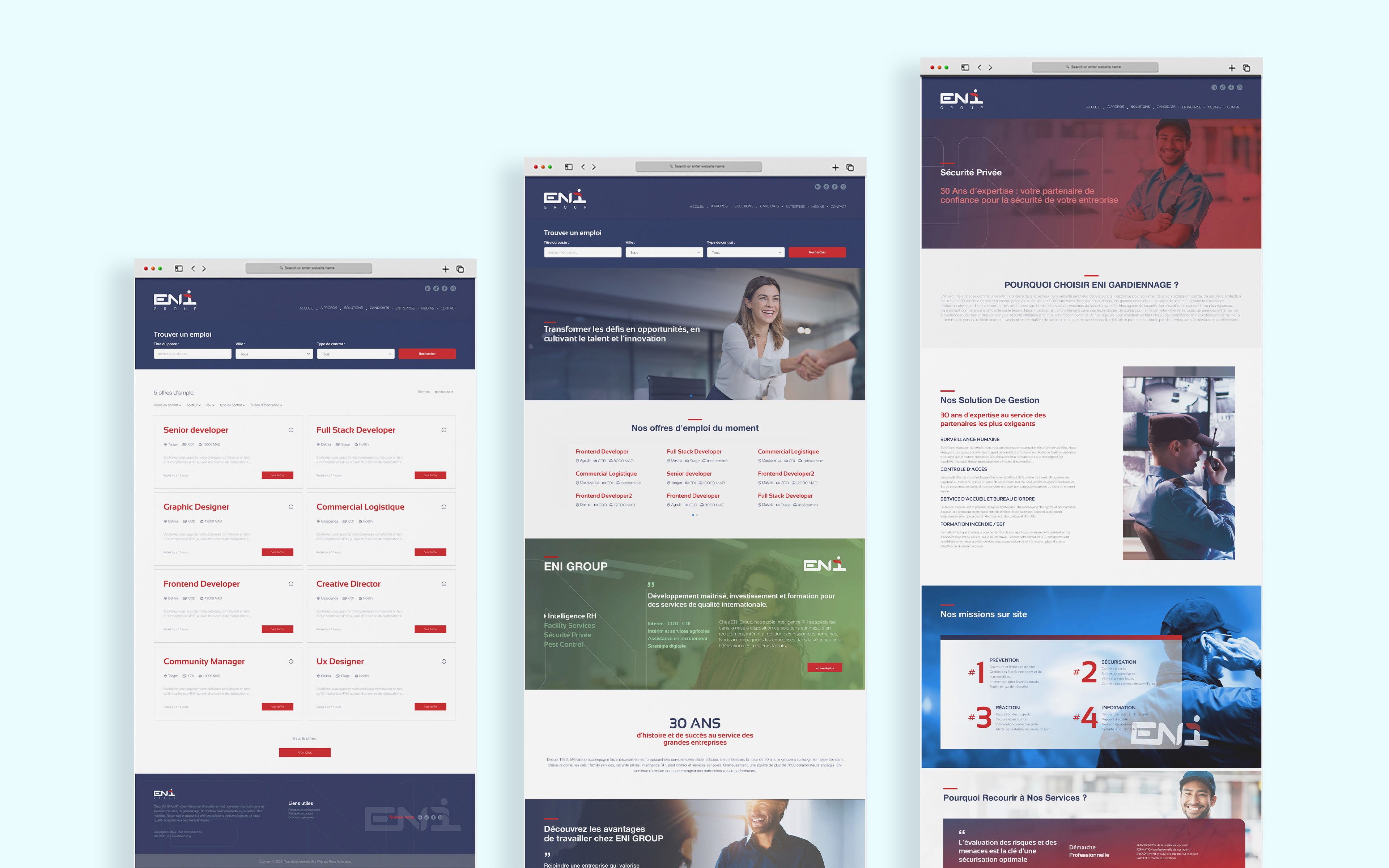
5. High-fidelity UI design.
6. Prototyping & handoff.
7. Web development.
The project started with a clear understanding of ENI Group’s goals and content structure. I designed low-fidelity wireframes to define layout and navigation, then moved to high-fidelity UI in Adobe XD, focusing on clarity, consistency, and alignment with the brand identity.
i ensured full responsiveness across desktop, tablet, and mobile. With four subsidiaries and modular content, I adapted each layout to maintain readability and structure on all screen sizes. I worked closely with the development team to deliver clean, responsive files ready for implementation.
Art Direction
The design approach centered on simplicity, clarity, and corporate professionalism. we used a clean layout with strong visual hierarchy and a neutral color palette dominated by navy blue, red and white. Each business unit was given its own dedicated space, while visual consistency was maintained across the site to reflect ENI Group’s unified brand.

My Role
As a graphic designer, I was in charge of designing the full visual interface of the ENI Group website using Adobe XD. While I’m not a UX specialist, I’m able to handle UX when necessary — and for this project, I structured the layouts with a clear content hierarchy and intuitive navigation to ensure a smooth user experience.
My core contribution focused on the UI design: I created page layouts, defined the visual system (colors, typography, components), and ensured consistency across the four business units. I also prepared the final design files for handoff and collaborated closely with the development team to bring the project to life.