Problem to Solve
The client wanted to boost brand awareness and connect emotionally with the target audience through positive, relatable visuals. The main challenge was to differentiate between the sub-brands while keeping the campaign cohesive and instantly recognizable as Caolina.
Project Objective
Create a visually unified print advertising campaign for Caolina's sub-brands (Fond’or, Pauz, and Bake), to be displayed on urban billboards. Each ad needed to reflect the identity of its product line while maintaining a consistent visual language aligned with the master brand.

Art Direction
Each product was associated with a different emotion:
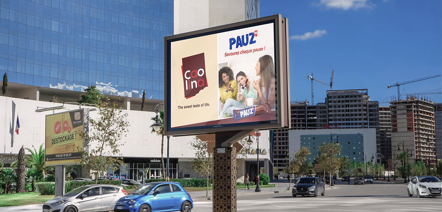
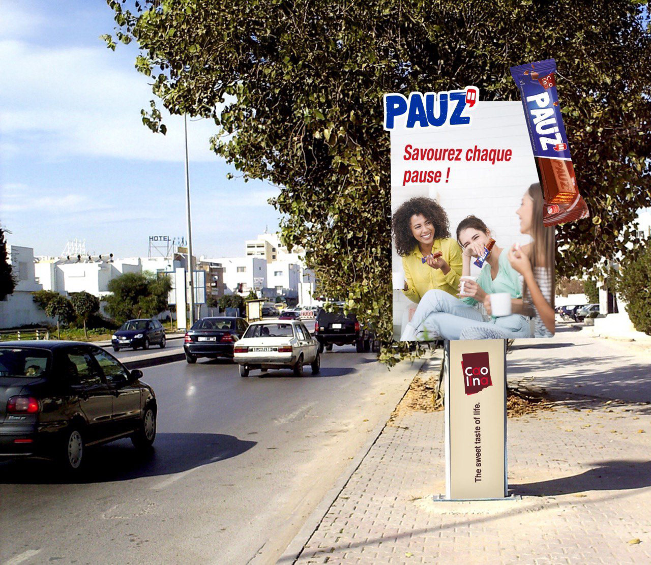
Pauz → Joy and friendship
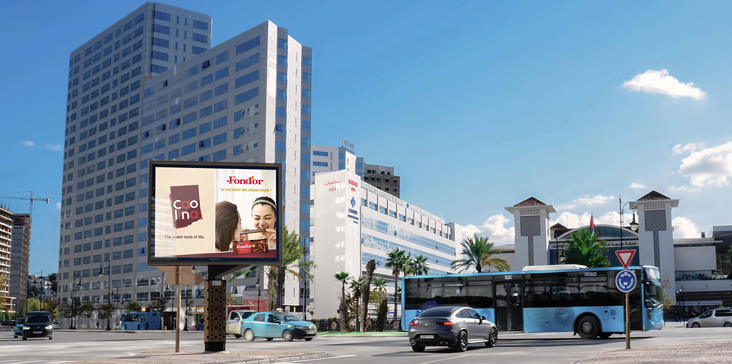
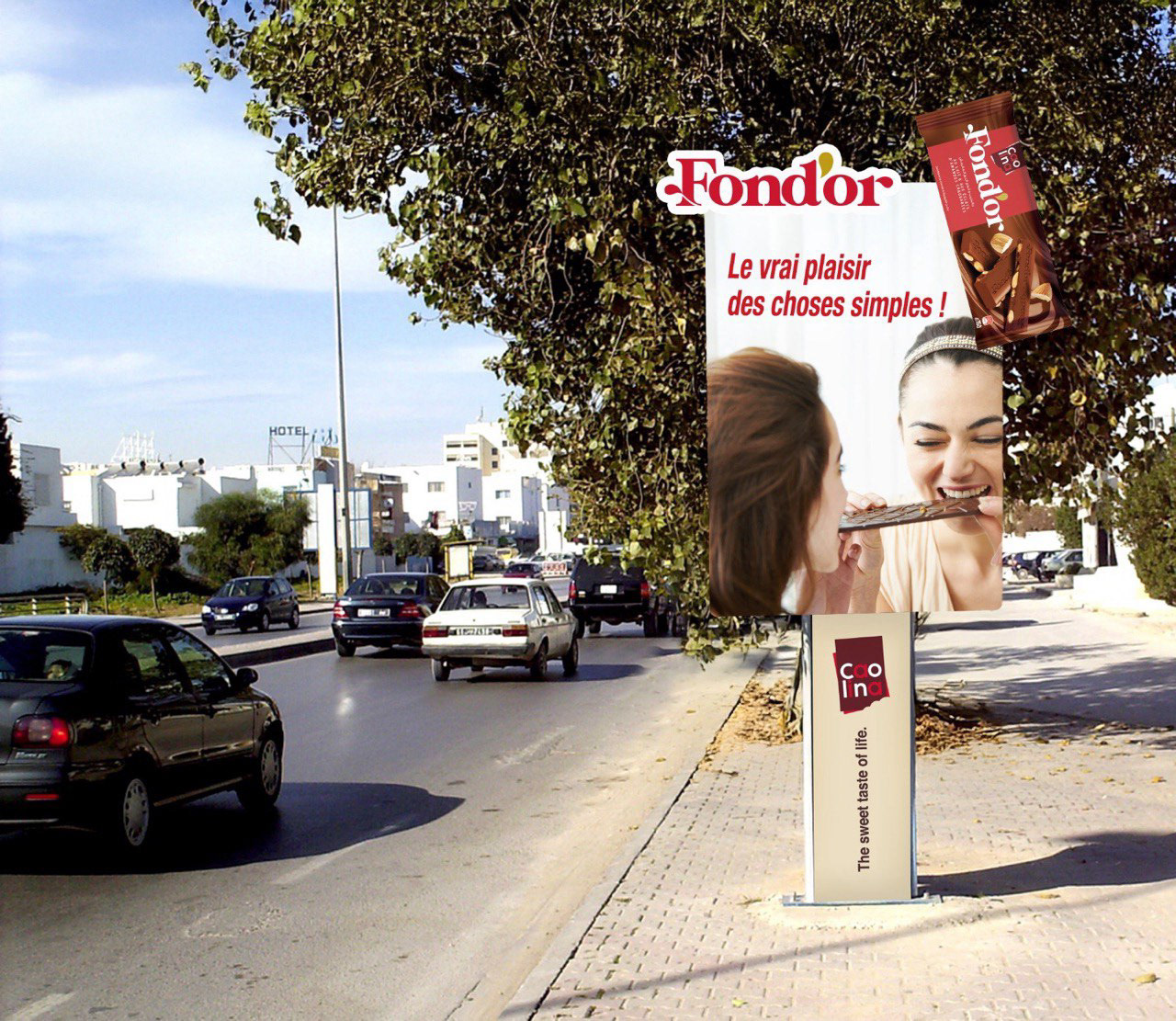
Fond’or → Simple pleasures
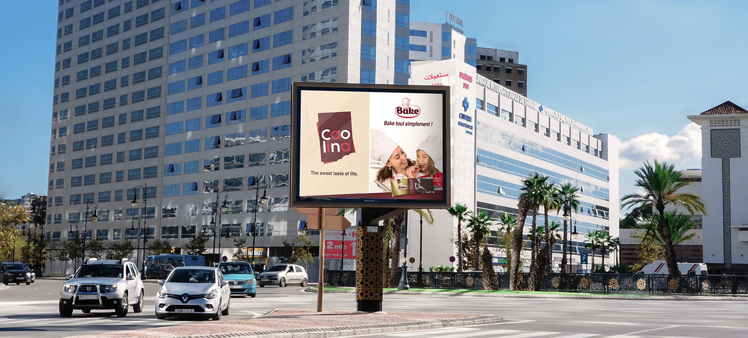
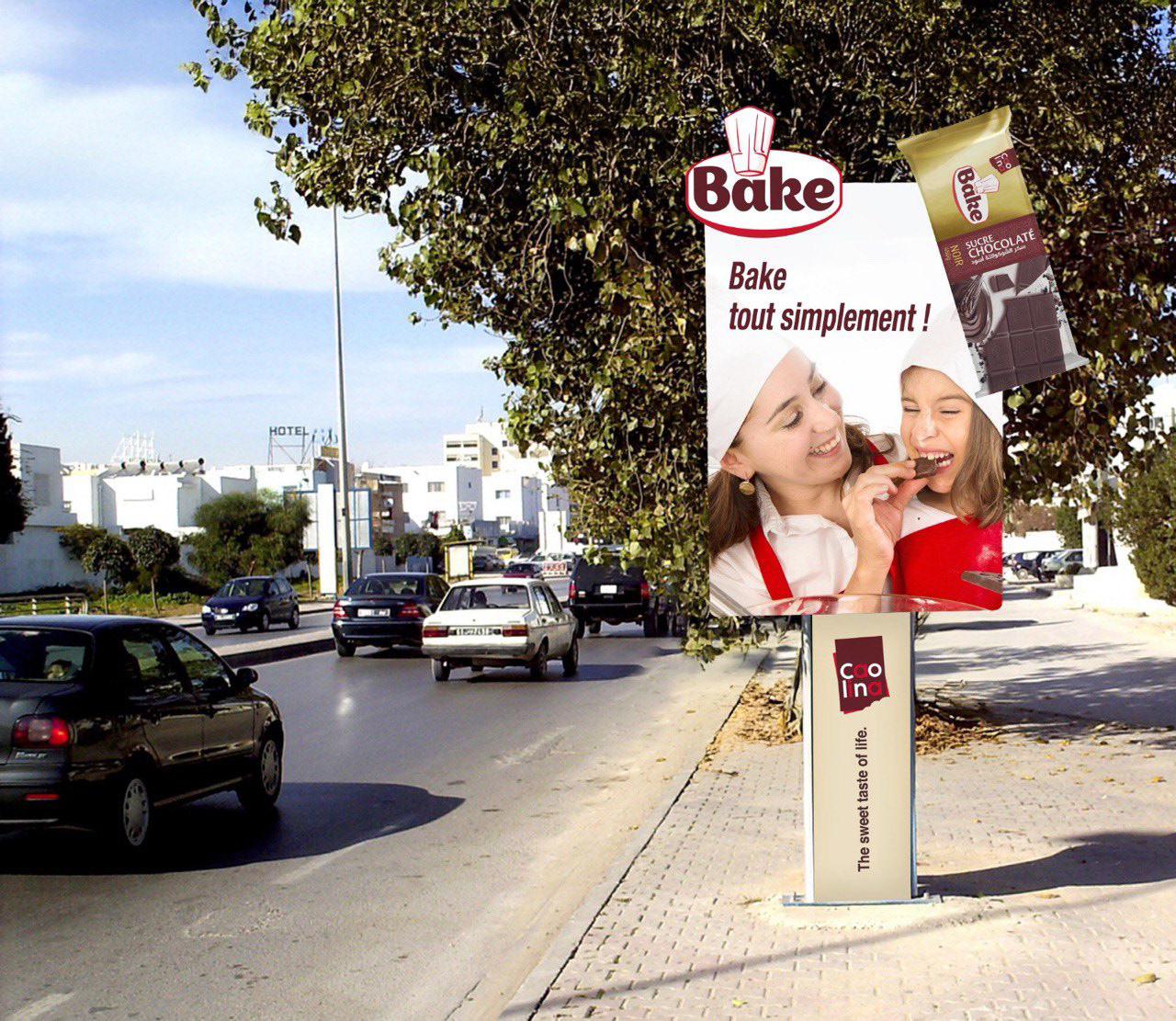
Bake → Family and love
We chose warm and soft color palettes, real-life photography, and clean compositions to reflect authenticity.
The Caolina logo and tagline were consistently placed for strong brand recall.
Process
Developed several layout proposals in Photoshop and Illustrator.
Retouched and color-graded photos for each product theme.
Created mockups to simulate the visuals in real-life billboard settings.
Delivered final files in large-format, print-ready resolution.
Result
The final campaign consisted of 6 visuals — two per product — displayed on city billboards. The result was a cohesive, emotionally engaging campaign that communicated the brand's diversity while reinforcing its core message: The sweet taste of life.
My Role
As the graphic designer, I was responsible for the entire visual execution of the print campaign — from concept to delivery. I handled layout design, photo editing, composition, and final mockups. I also worked with the marketing team to align the creative vision with strategic messaging and technical print requirements.