
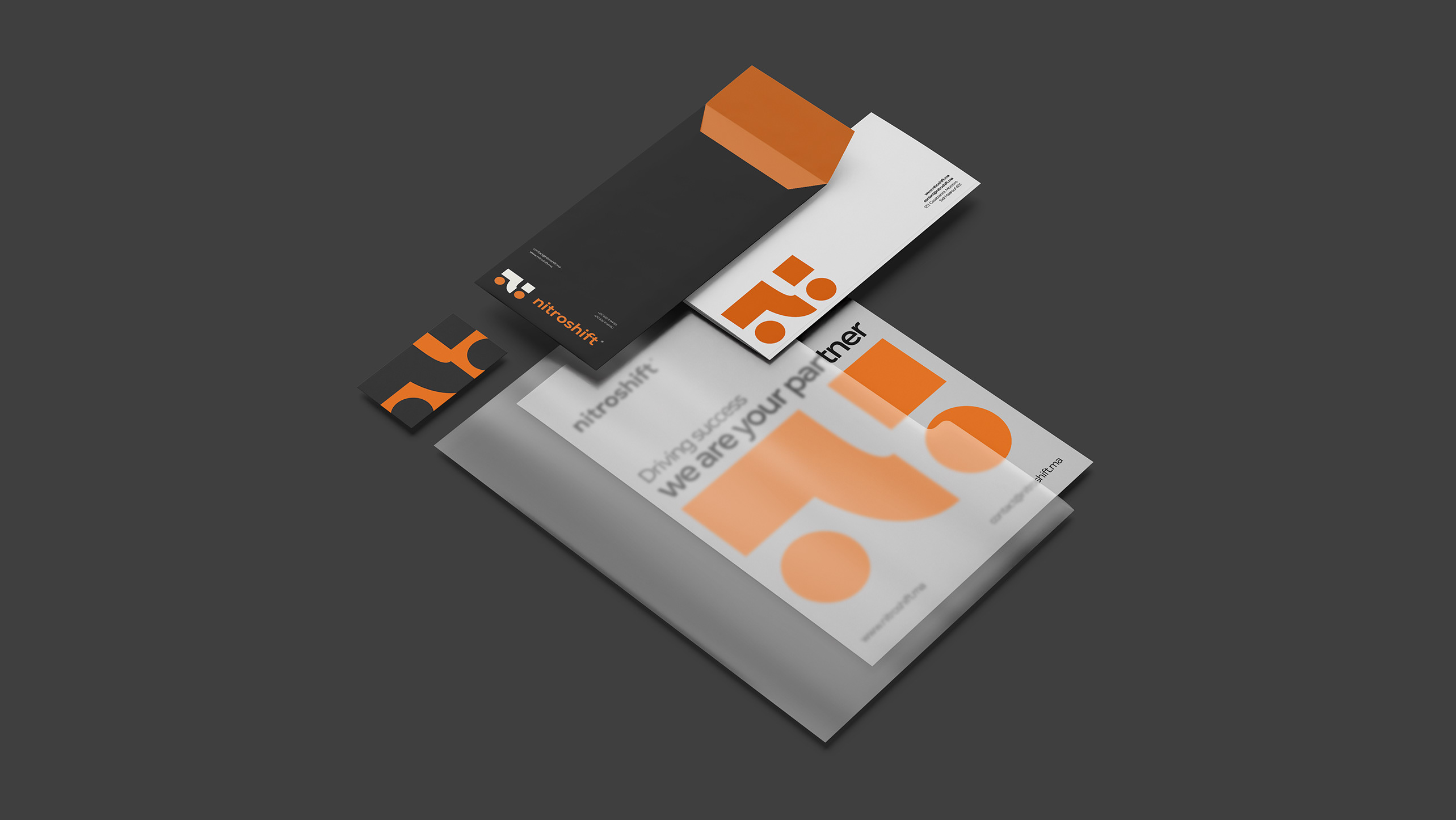
NITROSHIFT ® - VISUAL IDENTITY
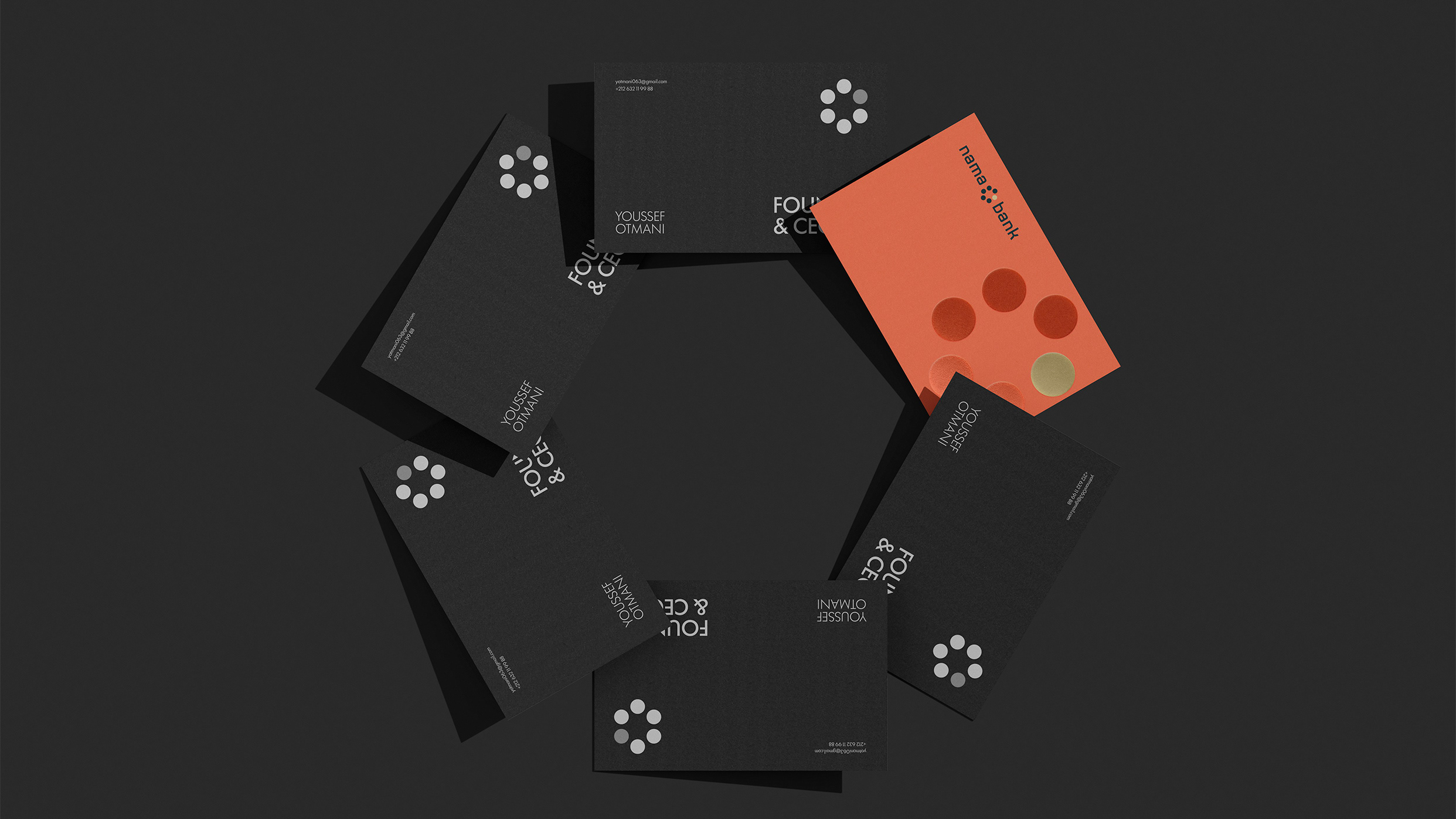
Nama Bank ™ - Visual Identity
NAMA is built around a simple idea: every form of growth starts with a small seed. The brand represents a new kind of Moroccan bank, modern, digital, and human, designed to make financial progress feel clear and accessible. Inspired by the data seed, the identity blends technology with warmth, creating a visual world where simplicity, logic, and innovation come together to help people move forward with confidence.

LUNA PASTEQUE ® - VISUAL IDENTITY
Luna Pastèque envisions a future where Earth’s freshness drifts beyond gravity. A watermelon launched toward the Moon becomes more than a fruit, it becomes a symbol of exploration, bold imagination, and quiet elegance. A soft moment suspended in the cosmos, where the simple meets the extraordinary.
My Personal Brand
A visual exploration of my identity as a graphic designer. Every element was meticulously crafted to faithfully reflect my artistic image and express my passion for aesthetics and graphic innovation.
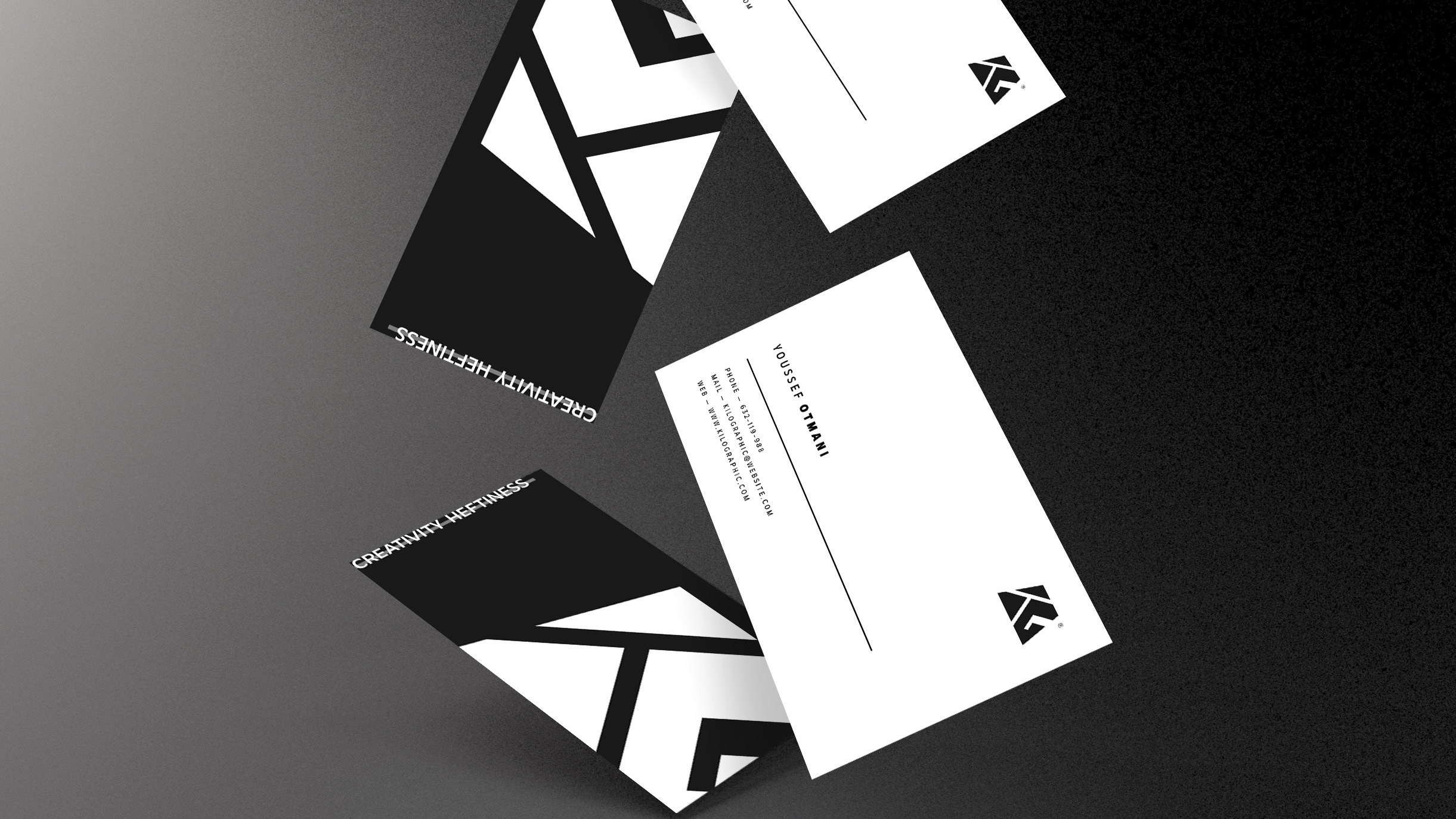
KiloGraphic ® - Visual Identity
The name "Kilographic" carries immense significance, symbolizing the power and heavy impact of design. The brand's weight and sophistication are represented by the colors and the letters "K" and "G" inside the kilogram symbol.
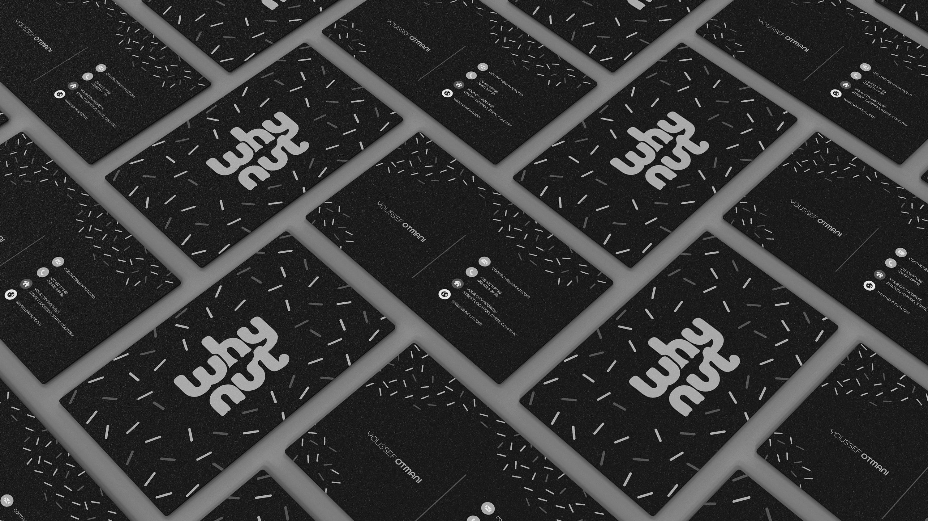
Whynut ® - Brand Identity
From logo to packaging, signage to merchandise, every element has been meticulously crafted to reflect the warmth, freshness, and simplicity that defines this unique donut coffee shop.